Total Pageviews

Wednesday 21 January 2015

Final Culminating: Critical Analysis

As the third portion of my classes culminating project is to write a critical analysis on a contemporary artist.  We were given two options for this portion of our culminating, the first option was that we could analyze the work of a contemporary artist that we believe best represents either represents current issues facing the Canadian society, or represents current trends in art.  The second option we were given is too explain the benefits and drawbacks of contemporary art.  Our teacher wants us to use plenty of examples to help illustrate our point of view on both sides of the issue if we choose this option.

I think that the second option is better for me.  The first step for me was to choose a contemporary artist that will clearly display the benefits and drawbacks of contemporary art.  In order to do this I made a bit of a list/criteria that I think contemporary artist would face in both the benefits and drawback aspects. After choosing an artist, I will be able to dive deeper into the benefits and drawbacks they face with there art, but for now, here is a bit of a general criteria:

Benefits
Drawbacks
Technology (websites, get paintings viewed)
Technology(easier to criticise work)
Easy access to materials
Compared to great artist
Wide variety of art styles
May not be appreciated

After looking for contemporary artists that fulfilled some of this criteria, I came up with two artists named Kristine Moran. Moran is a contemporary artists who has been listed on a website of 60 top painters in Canada, she must have worked pretty hard to be recognized like that.  The website actually has a lot of good contemporary painters on it if anyone would like to check it out.  The website link is http://www.60painters.com/artists.php. I looked through a few artists before choosing this women, but her artwork really stood out to me as  unique, innovative art.  I then searched her and found that she also both has a webpage, which fit into my criteria.  I now must dig a little deeper to find the benefits and drawbacks Moran.  .

Kristine Moran:
Moran was originally from Montreal. Her work has been shown in exhibitions at the Museum of Contemporary Canadian Art; Monica DeCardenas, Milan; Anna Kustera Gallery, NYC;  Kinkead Contemporary in LA, and Clark + Faria in Toronto. Moran has also held solo shows, holding her second one this past spring, at the Nicelle Beauchene Gallery in New York City.  Moran's work is greatly talked about in many areas and has even been reviewed in  many magazines and newspapers, as well as websites such as Artforum.com and Artslant.com,

This is exactly what I was saying was a benefit and drawback of contemporary art, it makes it so easy for art criticizers to state there opinion and spread it around to everyone.  This could make or destroy an artists career based on one opinion.

Lets look a little deeper into what review Moran got from Artslant.com:

"Kristine Moran’s work looks good on websites. It looks good in magazines and on gallery flyers. But oh, my god, it looks great in person. Maybe that’s why everyone and everyone’s mother turned out to see it at the opening of Between Life and Death at Daniel Faria last Friday. We were all there, local high rollers and sloppy art fans, clumped about on the gallery’s expansive floor space, trying and failing to talk to each other about something other than the pictures... But no matter — Moran’s canvasses sing on the white walls. The place looks less barren than bursting, even on a cold October night."
From this review, it seems that Moran has benefited from technology with being a contemporary artist.  More people can recognize her work, and have easy access to it, and with reviews like this one, the reader wants to go see her artwork in person.

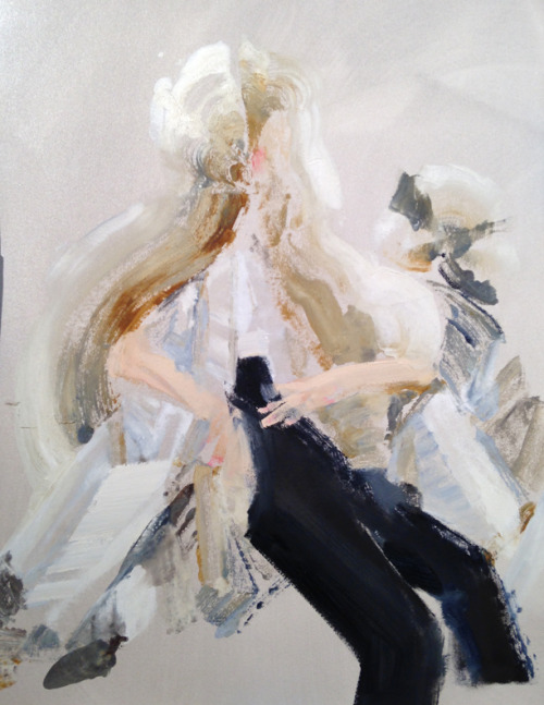
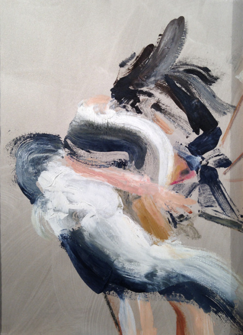
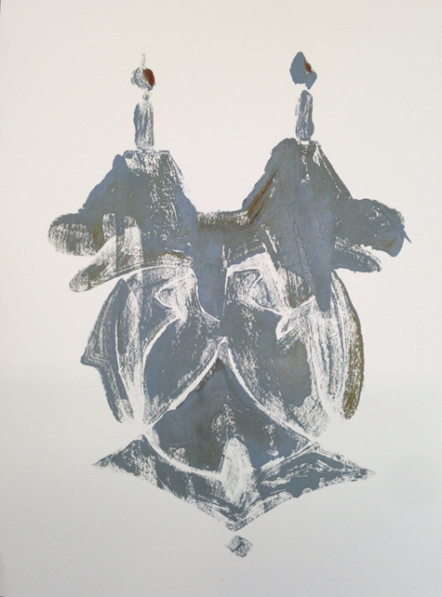
Moran does a variety of artwork including mostly figures, and symbols. Some of Morans more popular art pieces (found on http://www.kristinemoran.com/) include
Figures - Monotypes, oil on paper
Figures
Figures - Monotypes, oil on paper
Figures
Symbols. Monotypes, oil on paper
Symbol
Kristine Moran - 'Lillies in Midnight'
'Lillie's in Midnight'

I like her style of art.  Especially the figure paintings.  I like that you can make out what the figures should be based on line and color. But also that there are no outlines, and it allows the mind to fill in the blanks that the painting is missing.  Her artwork looks very elegant and the lines are smooth. The figure paintings make the viewers eyes believe that the painting is moving.


Kristine Moran talks about the struggles of doing her art with 'Art-Rated':

'The process can at some times be blissfully straightforward; an idea, a very quick sketch, loose com positional drawing on canvas and paint, and it somehow hits the mark at the first go. Other times, it’s a clumsy process of back and forth between sketch and painting. The sketch is re-drawn a few times as the painting evolves. The paint is applied and wiped down several times over.As the under-painting is done fairly thinly, I can work out subject matter, composition and ideas as I’m going along. I view it as a sort of reverse excavation. As I’m painting, shapes, figures and creatures will emerge. It’s up to me to cull them into existence, allowing the story to unfold naturally.I usually work on several paintings at once, especially while the subject matter is still emerging. I’ll work on one painting until it’s about three-quarters done and then leave it. I’ll do this for several paintings in a series. Then I can step back and see an overall theme developing, at which point, if one painting needs to change direction to tie in with the others, it’s still possible to do so.'

It is reassuring to hear a recognized artist hear about there struggles and drawbacks, and learn how the push through it.  It is nice to know that even great artists don't get it perfect the first time, that time must be spent on paintings to reach a level artists are happy with, and that everyone has there own way of doing art, and we all just need to find our own.

I also learned from reading the interview with Moran that sometimes your struggles are what can make the final art piece so great.

'Insomnia had a significant impact on my last body of work. I’d been sleepwalking and having nightly hallucinations. I was fighting it during the day and stressing about getting some painting done, when I finally realized that I could let my experience dictate the direction of the work. While doing this I recalled the author Robert Louis Stevenson, author of the Strange Case of Dr Jekyll and Mr Hyde, who seemed appropriate to my situation at the time–he often spoke of his vivid dreams dictating the course of his stories. At the same time, I fortuitously stumbled upon the writing of scientist Paul Broks, who said, “While sleeping the brain looses its grip on the self, the self tumbles into a thousand parts.” This became the underpinning for the 2011 exhibition titled Protean Slip at the Nicelle Beauchene Gallery in NYC.  The painted figures in that series transform into shadowy, fragmented shapes, floating against a nocturnal landscape.'

This is a piece from her series:
Kristine Moran - 'Somnambule'
'Somnambule' found on http://art-rated.com/?p=544

I like that the struggle she faced with this painting is what makes it so great. It looks to me like someone is stuck in cloud, or a daydream maybe, that is starting to self destruct.  It looks like the person is trying to escape the cloud by planting there feet firmly on the ground, but they cant get out because there feel are tied in with string.  They are trapped and they can not do anything to get out.

Morans style of art is very accepted in this culture, because everyone is looking for something that is a little different from the ordinary, but not totally out there.  Moran chooses colors that compliment each other, and stroke lines that compliment the painting.  

Another benefit of being a contemporary artist, is that there are a lot of art styles already. Moran can admire a lot of painting, and 'steal' concepts from them to make her own.  And she has admitted to doing this, she will incorporate colors or patterns of other artists work and make it her own.  

A drawback of doing art in this day and age is that so many ideas and painting styles are already almost designated to a persons name.  A lot of time you will hear people say that a certain piece, looks like DaVinci, or Piccasso. I think that Moran did a very good job at making her paintings stand out.  

Moran works with the benefits of being a contemporary artist, and learns to deal with the drawbacks.  She moved from Toronto to New York to pursue her career, and will have another exhibition in October.  

After doing some research on the benefits and drawbacks of contemporary art.  I think that the benefits defiantly out weigh the drawbacks, As long as the artist doesn't let the drawbacks destroy them.

Monday 19 January 2015

Creating the Japan Mural

After many days of brainstorming and designing the 'ideal' mural, our class finally came up with a final copy.  I don't actually have a picture of the final copy, because we kind of just went off a variety of peoples ideas.

A few days ago we started sketching out the mural.  Different people sketched out different parts of the mural so our side has a great level of diversity, in drawing techniques and shapes chosen to represent certain objects.  It was nice to see the classes ideas all come together to create the mural.

The final design defiantly portrays how much time and work we had put into the mural.  After the drawing was all done, we started painting it, and we knew we had to work fast because of how close the end of the semester is! (only 3 days away) We try to have as many people working on the mural at a time as we can because we know we are pressed for time. But on the other hand, we also do not want the mural to have too many people painting it at a time or it will start to look sloppy and crowded.  Unfortunately, this means that we can only have about 3-4 people working on it per day, which means some students don't get the chance to work on it at all.  Luckily, the students that don't get to participate in the actual drawing or painting of the mural get to design and paint there own that will be sent back to Japan!

I was not there on the day that the students in my class first started painting the mural, so when I came back some progress had already been made! And I had some knowledge about what it was like to work with the paints that Japan sent us.

We are only aloud to use the paints that Japan sent us because Japan has done this before, and they know what paints work on the type of material we are working with, and what types will not crack when the mural is folded.

Anyways, the paints are pretty runny, so you do not need a lot to go a long way, which is good because they didn't have to send us as much in the mail. It is also kind of tricky though because most of our class is used to working with acrylic paint, so we generally usually use a lot, it took a bit of getting used to, but I think we have the hang of it now!  Also, the paint that they sent us mixes kind of funny, not all of the colors, but when trying to make colors like dark blue, you must mix black, white, blue, and magenta.  Luckily one of the students in my class discovered this (Kylie).  So we now have an even greater variety of color. Most of the other paints mix fairly normal though.

When painting this mural we decided to first start with the background, which includes trees, mountains, water, and the sky.  We have now finished the sky and mountains, and we are working toward completing the water and the trees.  I really hope that the paint is easy to go over, and the colors that were previously painted will not seep through the new paint.  The students in my class have however been pretty careful to stay within the lines, so we might not have anything to worry about.

As for what has been done so far, Abbi painted the sky, and is currently working on the water.  Olivia started the grey mountains, and I finished them, and Kylie is almost done the blue mountains.

This is a pretty neat mural to do, because we are doing a mix of cultures, realism, group of 7 style art, and many more! It is different than anything I have ever been a part of before, and seeing how it is now, I think it will look really good when it is all done! And compliment the Japan side nicely.

Here are a few pictures of the progress made so far.


Kylie doing blue mountains. Olivia doing grey ones.

My grey mountains next to Kylies.

Progress so far.

Monday 12 January 2015

Japan Mural Culminating

The other day my class came together and brainstormed a bunch of ideas for our Japan mural. 

We all came up with a general outline of what we wanted to do and include in our portion of the mural. 

We decided we would have the setting be in fall, we would have two people, in a stance like this: 


(done by Dakota) 

One would be of the aboriginal culture and one would not. We would incorporate classic native drawings, and Group of 7 style are.  We would have the two people hiking and looking out at mountains. We should try and include a totem pole (maybe morphed into a tree- idea by Kylie) and we wanted lots of fall colors. 

We were asked to incorporate all of these into a design of our own, mixed with a color scheme we liked, here is mine :) 


Thursday 8 January 2015

Final Culminating: Japan Portion

In many of my previous blog posts, I talked about the co-operative project we have with Japan.  We finally got there portion of the mural in the mail, so we are incorporating our portion of the mural, and the planning we do as individuals as a big part of our culminating project.

A few days ago, we got the parcel in the mail, we opened it up as a class, and found lots of Japanese treats, cool masks, and neat paper designs inside!

Here are some pictures of what they sent us.


This was really cool because it got the majority of my class hyped up about finishing the other half of the mural.  We opened the mural last, and here is what we saw.


We now have the mural hanging over the whiteboard in our classroom so the whole class can see it  while we are planning out what we will do on our half.

We were all asked to brainstorm and sketch either 3 or 4 ideas for possible layouts on the other half of the mural, we will then talk about these ideas as a class and choose the one we like the most, and the one most suitable to match the half of the mural that has already been painted.

We must remember that the theme of this mural is our legacy (what we want to leave behind).  We must also take into consideration certain criteria while designing our half of the mural. This criteria includes color scheme, how well the layout goes with the Japanese side, originality, and if our design actually matches up with the Canadian culture, and legacy.

Yesterday, I sketched out 4 possible ideas.  I will talk about them from least favorite to favorite.


Here is a picture of all 4, assume the first is 1 and the rest are in order until 4.

Least favorite: 4

This one is my least favorite design.  I like the rainbow, because that would add color it our side, but that's about it.  I think some of the reasons this one is my least favorite is because it was my last design so I had kind of already used up the rest of my ideas.  Also, there is no real planning to it, I just drew what ever came to mind.  It doesn't look like it would mesh with the Japanese side very well.

Second least favorite: 3

This is my second lease favorite.  I kind of like the layout of this one, just because I have the trees going around, with the rocky's in the bad, and the hockey as a focus in the middle.  But I feel like this is too typical, like its saying that all Canada is is winter and hockey.  I feel like this is something that Japan would be expecting to get back in return, and we should give them something more original than that.  I want to show a real Canadian legacy, not something you would find if you searched Canada on Google images.

Second favorite: 1

This one is my second favorite.  I like the idea that this one has a kind of circular pattern, it looks welcoming.  Also, if we were to do a campfire picture like this, we could have a lot of warm colors, and basically make the people wear any color to match and compliment the color scheme of the Japanese side.  This also shows community involvement, and how we come from a very close knit community.  Doing this design could also allow everyone in my class to get involved, everyone could be responsible for painting one person of something.  The reason I do not like this one is because its a pretty dark picture and I would like it to be bright.  Which brings me to my favorite sketch.

My favorite: 2

This one is my favorite for many reasons.  I like how it is like copying Japan's idea.  We would be using the same layout basically, but changing their point of view to ours.  We could show the nature aspect and show how beautiful Canada really is.  We would have our animals instead of theirs, our trees, and our views.  I really like this idea because we would already have a general outline to go from.  This would also look really cool as a whole mural, and it would look like we pre planned it.  We could do fall colors and make the color schemes similar.

We will be choosing the layout tomorrow, whatever it is, I hope its something good that makes everyone happy:)


Tuesday 6 January 2015

Gingerbread House

I meant to post about how our gingerbread project went over the Christmas Break, but I got really busy so I figured better late then never!

It took us a few days to bake and decorate them.  Here are some of our steps in pictures.


The tools we were using to decorate them were kinda bulky and hard to use, so we did the best we could under the circumstances.  I didn't think they looked so bad, and they tasted pretty good!

We noticed the night before that they were a bit soft for gingerbread, so we just left them out uncovered for the night to harden up a bit.

After that they were perfect, as for hiding them, we didn't get around to that.  It was too busy on the last day of school, and I was the only one out my group to show up, so I just put them in the office.  They almost all got eaten, which was pretty good considering the amount of kids that showed up on the last day.

All in all I'm happy with the turn out :)